
 A SCHOLARLY BOOK REPOSITORY
Finalist for the 2002 National Book Critics Circle Award.
Chromatic Algorithms reveals the fascinating history behind digital color, tracing it from the work of a few brilliant computer scientists and experimentally minded artists in the late 1960s and early ‘70s through to its appearance in commercial software in the early 1990s. Mixing philosophy of technology, aesthetics, and media analysis, Carolyn Kane shows how revolutionary the earliest computer-generated colors were—built with the massive postwar number-crunching machines, these first examples of “computer art” were so fantastic that artists and computer scientists regarded them as psychedelic, even revolutionary, harbingers of a better future for humans and machines. But, Kane shows, the explosive growth of personal computing and its accompanying need for off-the-shelf software led to standardization and the gradual closing of the experimental field in which computer artists had thrived.
Even so, the gap between the bright, bold presence of color onscreen and the increasing abstraction of its underlying code continues to lure artists and designers from a wide range of fields, and Kane draws on their work to pose fascinating questions about the relationships among art, code, science, and media in the twenty-first century.
Garau, a painter who teaches the psychology of form, pays particular attention to the way colors behave when organized in patterns. His theory of color combination addresses two principal compositional elements: the relations between figure and ground and the phenomenon of transparency.
Garau meticulously analyzes the use of color in paintings by masters such as Cézanne, Picasso, and Matisse to show how his theory applies to actual works of art. Containing many full-color examples, his introduction to the workings of color relations is of great practical use to art historians and critics, artists, interior decorators, fashion and set designers, and anyone who works with color to display information or convey emotions.
"In an area of the psychology of art where reliable guidance is still so hard to come by, [Garau's] well-supported contributions to the theory of color composition ought to be welcomed by practitioners and scholars alike."—from the Foreword by Rudolf Arnheim
The Luminous and the Grey explores the places where color comes into being and where it fades away, probing when it begins and when it ends both in the imagination and in the material world. Batchelor draws on neuroscience, philosophy, novels, films, and artists’ writings—as well as his own experience as an artist working with color—to understand how we see and use colors. He considers the role of color in creation myths, industrial chemistry, and optics, and examines the particular forms of luminosity that saturate the modern city. Following this inquiry into the hues that we face every day, he turns to one that is both color and noncolor: grey itself, which he reveals is as much a mood, feeling, and existential condition as a shade that we experience with our eyes.
Deftly argued, always thought-provoking, and ever entertaining, The Luminous and the Grey is a beautiful study of how we see and feel our multicolored world.
How fluorescent orange symbolizes the uneven distribution of safety and risk in the neoliberal United States
Safety Orange first emerged in the 1950s as a bureaucratic color standard in technical manuals and federal regulations in the United States. Today it is most visible in the contexts of terror, pandemic, and environmental alarm systems; traffic control; work safety; and mass incarceration. In recent decades, the color has become ubiquitous in American public life—a marker of the extreme poles of state oversight and abandonment, of capitalist excess and dereliction. Its unprecedented saturation encodes the tracking of those bodies, neighborhoods, and infrastructures judged as worthy of care—and those deemed dangerous and expendable.
Here, Anna Watkins Fisher uses Safety Orange as an interpretive key for theorizing the uneven distribution of safety and care in twenty-first-century U.S. public life and for pondering what the color tells us about neoliberalism’s intensifying impact often hiding in plain sight in ordinary and commonplace phenomena.
Forerunners: Ideas First is a thought-in-process series of breakthrough digital publications. Written between fresh ideas and finished books, Forerunners draws on scholarly work initiated in notable blogs, social media, conference plenaries, journal articles, and the synergy of academic exchange. This is gray literature publishing: where intense thinking, change, and speculation take place in scholarship.
In this illuminating book, Simon Morley unpacks the meanings of the monochrome as it has developed internationally over the twentieth century to today. In doing so, he also explores how artists have understood what they make, how critics variously interpret it, and how art is encountered by viewers.
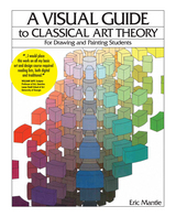
Eric Mantle presents the basics of classical theory in a clear and concise manner for all beginning drawing and painting students. His book features diagrams that illustrate every concept. Students will see the complexities of color theory and understand how to create the illusion of volume and depth on a 2-dimensional surface. “As an art student,” Professor Mantle recalls, “I was frequently frustrated by instructional books that gave lengthy verbal descriptions of visual concepts and then showed small and/or unclear diagrams of those concepts. As an art teacher, I found that my students would gain a clearer understanding of a visual concept if my verbal explanation was combined with a diagram of that concept.”
A Visual Guide to Classical Art Theory is great for both traditional and non-traditional media. Each page, theory and diagram represents a different tool for the artist to use. Through their use, the artist will find an infinite number of solutions. Artists also may use the book to create a trompe-l’oeil effect in graffiti art or the illusion of volume and depth on the computer. A Visual Guide to Art Theory is presented in a unique, non-verbal format that clearly illustrates the effect of perspective on color, light and shade.
READERS
Browse our collection.
PUBLISHERS
See BiblioVault's publisher services.
STUDENT SERVICES
Files for college accessibility offices.
RECENTLY PUBLISHED


UChicago Accessibility Resources
home | accessibility | search | about | contact us
BiblioVault ® 2001 - 2025
The University of Chicago Press