
 A SCHOLARLY BOOK REPOSITORY
17 start with R start with R

Cultural stereotypes to the contrary, approximately half of all video game players are now women. A subculture once dominated by men, video games have become a form of entertainment composed of gender binaries. Supported by games such as Diner Dash, Mystery Case Files, Wii Fit, and Kim Kardashian: Hollywood—which are all specifically marketed toward women—the gamer industry is now a major part of imagining what femininity should look like.
In Ready Player Two, media critic Shira Chess uses the concept of “Player Two”—the industry idealization of the female gamer—to examine the assumptions implicit in video games designed for women and how they have impacted gaming culture and the larger society. With Player Two, the video game industry has designed specifically for the feminine ideal: she is white, middle class, heterosexual, cis-gendered, and abled. Drawing on categories from time management and caregiving to social networking, consumption, and bodies, Chess examines how games have been engineered to shape normative ideas about women and leisure.
Ready Player Two presents important arguments about how gamers and game developers must change their thinking about both women and games to produce better games, better audiences, and better industry practices. Ultimately, this book offers vital prescriptions for how one of our most powerful entertainment industries must evolve its ideas of women.
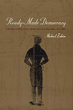
By the early nineteenth century, homespun began to disappear from the American material landscape. Exhortations of industry and modesty, however, remained a common fixture of public life. In fact, they found expression in the form of the business suit. Here, Zakim traces the evolution of homespun clothing into its ostensible opposite—the woolen coats, vests, and pantaloons that were "ready-made" for sale and wear across the country. In doing so, he demonstrates how traditional notions of work and property actually helped give birth to the modern industrial order. For Zakim, the history of men's dress in America mirrored this transformation of the nation's social and material landscape: profit-seeking in newly expanded markets, organizing a waged labor system in the city, shopping at "single-prices," and standardizing a business persona.
In illuminating the critical links between politics, economics, and fashion in antebellum America, Ready-Made Democracy will prove essential to anyone interested in the history of the United States and in the creation of modern culture in general.
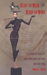
Green focuses on issues of fashion and fabrication as they involve both the production and consumption of clothing. Traditionally, much of the urban garment industry has been organized around small workshops and flexible homework, and Green emphasizes the effect this labor organization had on the men and mostly women who have sewn the garments. Whether considering the immigrant Jews, Italians, Puerto Ricans, Dominicans, and Chinese in New York or the Chinese-Cambodians, Turks, Armenians, and Russian, Polish, and Tunisian Jews in Paris, she outlines similarities of social experience in the shops and the unions, while allowing the voices of the workers, in all their diversity to be heard.
A provocative examination of gender and ethnicity, historical conflict and consensus, and notions of class and cultural difference, Ready-to-Wear and Ready-to-Work breaks new ground in the methodology of comparative history.
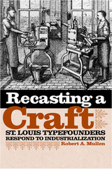
In the nineteenth and early twentieth centuries, type for newspapers and books was set one letter at a time, and the manufacturers of the metal type used in the printing trade were called typefounders. This prominent yet rarely documented industry was essential to the development of modern American publishing and was particularly prevalent in St. Louis. In Recasting a Craft: St. Louis Typefounders Respond to Industrialization, Robert A. Mullen recognizes the city’s significant contributions to typefounding and details how the craft fundamentally changed through mechanization, growth, and the creation of a large conglomerate.
Like many trades of the nineteenth and early twentieth centuries that were eventually lost to industrialization, the typefoundries of St. Louis grew from small shops to factories with organized labor. Mullen describes three distinct periods of the industry that emerged in St. Louis’s typefounding trade: the early struggles in establishing the industry there, the period of intense competition and creative enterprise, and the proliferation of new companies that appealed to those customers who felt alienated by the monopolizing older companies.
Mullen discusses at length the technological, social, and demographic foundations of the immense growth of the trade in the nineteenth century, identifying the changes in typographical design and the demand for it in the new era of advertising. He also profiles the workers, working conditions, and labor issues—such as the failed industry-wide strike of 1903—that emerged as the craft of typefounding entered the industrial age. More than two hundred type designs that originated with the St. Louis firms are listed in an appendix with examples of each face. The volume also contains a list of the catalogs of the St. Louis typefoundries known to exist in the public and academic libraries of the United States.
In addition to the explicit goal of advancing mutual economic interests, regional economic organizations (REOs) are intended to foster regional cohesion and peace. Drawing on a data set detailing the institutional features of 25 REOs established during the 1980s and 1990s, complemented by a case study of ASEAN, Yoram Z. Haftel investigates the factors that affect REOs' ability to mitigate interstate military conflict. He finds fewer interstate conflicts among REO members who have developed high levels of economic integration and who cultivate regular interaction among member-states' representatives. Haftel concludes that, with an appropriate institutional design and fully implemented agreements, an REO can indeed play a role in mitigating interstate conflict and make a meaningful contribution to regional peace.
A critique of prominent architects’ approach to digitally driven design and labor practices over the past two decades
With the advent of revolutionary digital design and production technologies, contemporary architects and their clients developed a taste for dramatic, unconventional forms. Seeking to amaze their audiences and promote their global brands, “starchitects” like Herzog & de Meuron and Frank Gehry have reaped substantial rewards through the pursuit of spectacle enabled by these new technologies. This process reached a climax in projects like Gehry’s Guggenheim Bilbao and the “Bilbao effect,” in which spectacular architectural designs became increasingly sought by municipal and institutional clients for their perceived capacity to enhance property values, which author Pedro Fiori Arantes calls the “rent of form.”
Analyzing many major international architectural projects of the past twenty years, Arantes provides an in-depth account of how this “architecture of exception” has come to dominate today’s industry. Articulating an original, compelling critique of the capital and labor practices that enable many contemporary projects, Arantes explains how circulation (via image culture), consumption (particularly through tourism), the division of labor, and the distribution of wealth came to fix a certain notion of starchitecture at the center of the industry.
Significantly, Arantes’s viewpoint is not that of Euro-American capitalism. Writing from the Global South, this Brazilian theorist offers a fresh perspective that advances ideas less commonly circulated in dominant, English-language academic and popular discourse. Asking key questions about the prevailing logics of finance capital, and revealing inconvenient truths about the changing labor of design and the treatment of construction workers around the world, The Rent of Form delivers a much-needed reevaluation of the astonishing buildings that have increasingly come to define world cities.

What has been missing, however, is detailed guidance for restoration practitioners wanting to undertake similar urban stream restoration projects that worked with, rather than against, nature. This book presents the author’s thirty years of practical experience managing long-term stream and river restoration projects in heavily degraded urban environments. Riley provides a level of detail only a hands-on design practitioner would know, including insights on project design, institutional and social context of successful projects, and how to avoid costly and time-consuming mistakes. Early chapters clarify terminology and review strategies and techniques from historical schools of restoration thinking. But the heart of the book comprises the chapters containing nine case studies of long-term stream restoration projects in northern California. Although the stories are local, the principles, methods, and tools are universal, and can be applied in almost any city in the world.
Bell-bottoms are in. Bell-bottoms are out. Bell-bottoms are back in again. Fads constantly cycle and recycle through popular culture, each time in a slightly new incarnation. The term “retro” has become the buzzword for describing such trends, but what does it mean? Elizabeth Guffey explores here the ambiguous cultural meanings of the term and reveals why some trends just never seem to stay dead.
Drawing upon a wealth of original research and entertaining anecdotal material, Guffey unearths the roots of the term “retro” and chronicles its evolving manifestations in culture and art throughout the last century. Whether in art, design, fashion, or music, the idea of retro has often meant a reemergence of styles and sensibilities that evoke touchstones of memory from the not-so-distant past, ranging from the drug-induced surrealism of psychedelic art to the political expression of 1970s afros.
Guffey examines how and why the past keeps coming back to haunt us in a variety of forms, from the campy comeback of art nouveau nearly fifty years after its original decline, to the infusion of art deco into the kitschy glamor of pop art, to the recent popularity of 1980s vogue. She also considers how advertisers and the media have employed the power of such cultural nostalgia, using recycled television jingles, familiar old advertising slogans, and famous art to sell a surprising range of products.
An engrossing, unprecedented study, Retro reveals the surprising extent to which the past is embedded in the future.
2023 50 Books | 50 Covers Award, The American Institute of Graphic Arts (AIGA)
2024 Honorable Mention, Design Awards, Graphis
2024 Finalist, Typography Competition, Communication Arts Magazine
A beautifully illustrated exploration of the Rob Roy Kelly American Wood Type Collection.
The Rob Roy Kelly Wood Type Collection is a comprehensive collection of wood type manufactured and used for printing in nineteenth-century America. Comprising nearly 150 typefaces of various sizes and styles, it was amassed by noted design educator and historian Rob Roy Kelly starting in 1957 and is now held by the University of Texas. Although Kelly himself published a 1969 book on wood type and nineteenth-century typographic history, there has been little written about the creation of the wood type forms, the collection, or Kelly.
In this book, David Shields rigorously updates and expands upon Kelly’s historical information about the types, clarifying the collection’s exact composition and providing a better understanding of the stylistic development of wood type forms during the nineteenth century. Using rich materials from the period, Shields provides a stunning visual context that complements the textual history of each typeface. He also highlights the non-typographic material in the collection—such as borders, rules, ornaments, and image cuts—that have not been previously examined. Featuring over 300 color illustrations, this written history and catalog is bound to spark renewed interest in the collection and its broader typographic period.
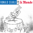
Since 1995, Searle has plied his sardonic trade on the coveted op-ed pages of the French daily newspaper Le Monde. This book presents more than a hundred of the best of these cartoons, ranging across politics, the new Europe, the nature of the contemporary economy, social games, and various "angels," both benign and mischievous. Whether skewering the greed of the rich with images of men in suits padding each other's pockets with cash or conducting business under the table, or making a poignant comment about how much harder peace has to work than war to stay in the same place, Searle displays the same pungent, incisive, yet infinitely humane wit. The deceptive simplicity of his lines and shadings combine with meticulously observed details of dress, background, and facial expression to produce arresting images that convey his messages powerfully and beautifully.
By turns delightful, amusing, and disturbing, but always deeply thought provoking, Searle's work reaches well beyond the specific occasion that inspired a given cartoon to illuminate key aspects of public life in the West at the end of the millennium. This book contains twenty-five illustrations not found in the French edition, together with a new preface for English-speaking readers written by Searle himself.
One reason budget rules are ineffective, David Primo shows, is that politicians often create and preserve loopholes to protect programs that benefit their constituents. Another reason is that legislators must enforce their own provisions, an arrangement that is seriously compromised by their unwillingness to abide by rules that demand short-term sacrifices for the sake of long-term gain. Convinced that budget rules enacted through such a flawed legislative process are unlikely to work, Primo ultimately calls for a careful debate over the advantages and drawbacks of a constitutional convention initiated by the states—a radical step that would bypass Congress to create a path toward change. Rules and Restraint will be required reading for anyone interested in institutional design, legislatures, and policymaking.
READERS
Browse our collection.
PUBLISHERS
See BiblioVault's publisher services.
STUDENT SERVICES
Files for college accessibility offices.
RECENTLY PUBLISHED


UChicago Accessibility Resources
home | accessibility | search | about | contact us
BiblioVault ® 2001 - 2024
The University of Chicago Press